Building a Scalable and Efficient Email Design System.
Client
MasterClass
Year
2021
Services
UI/UX
A/B testing
Prototyping
Coding
Design
Programs
Figma
Iterable
HTML
CSS
Handlebars
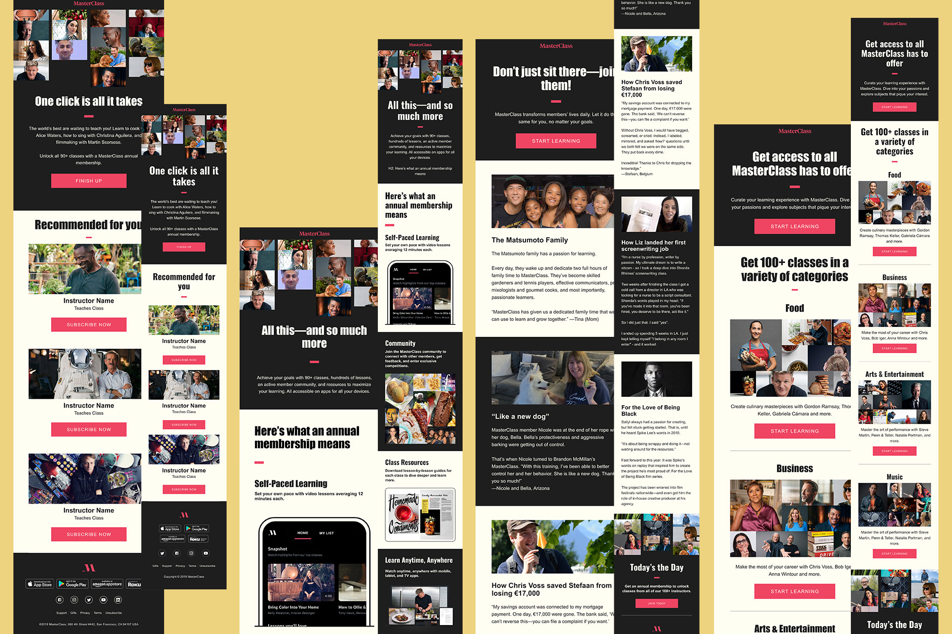
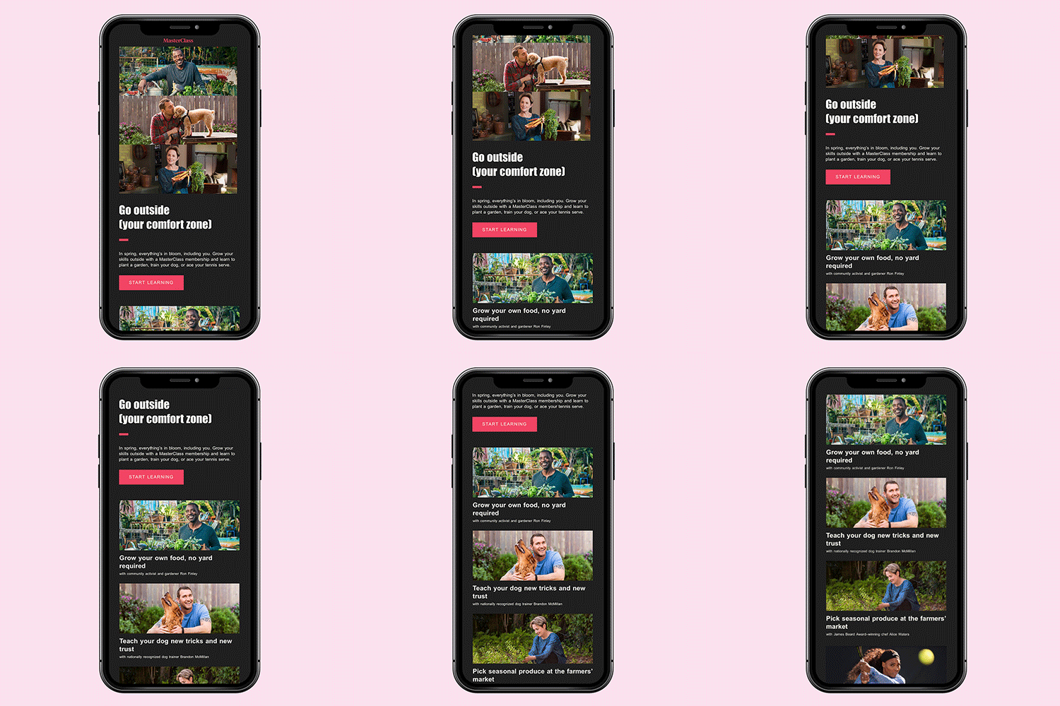
We employed an iterative design process combined with continuous testing to drive ongoing improvement and growth.
Prioritizing modular, reusable components to ensure consistency and scalability, we created flexible layouts with a responsive grid system, customizable modules, and clear guidelines for typography, colors, and spacing.
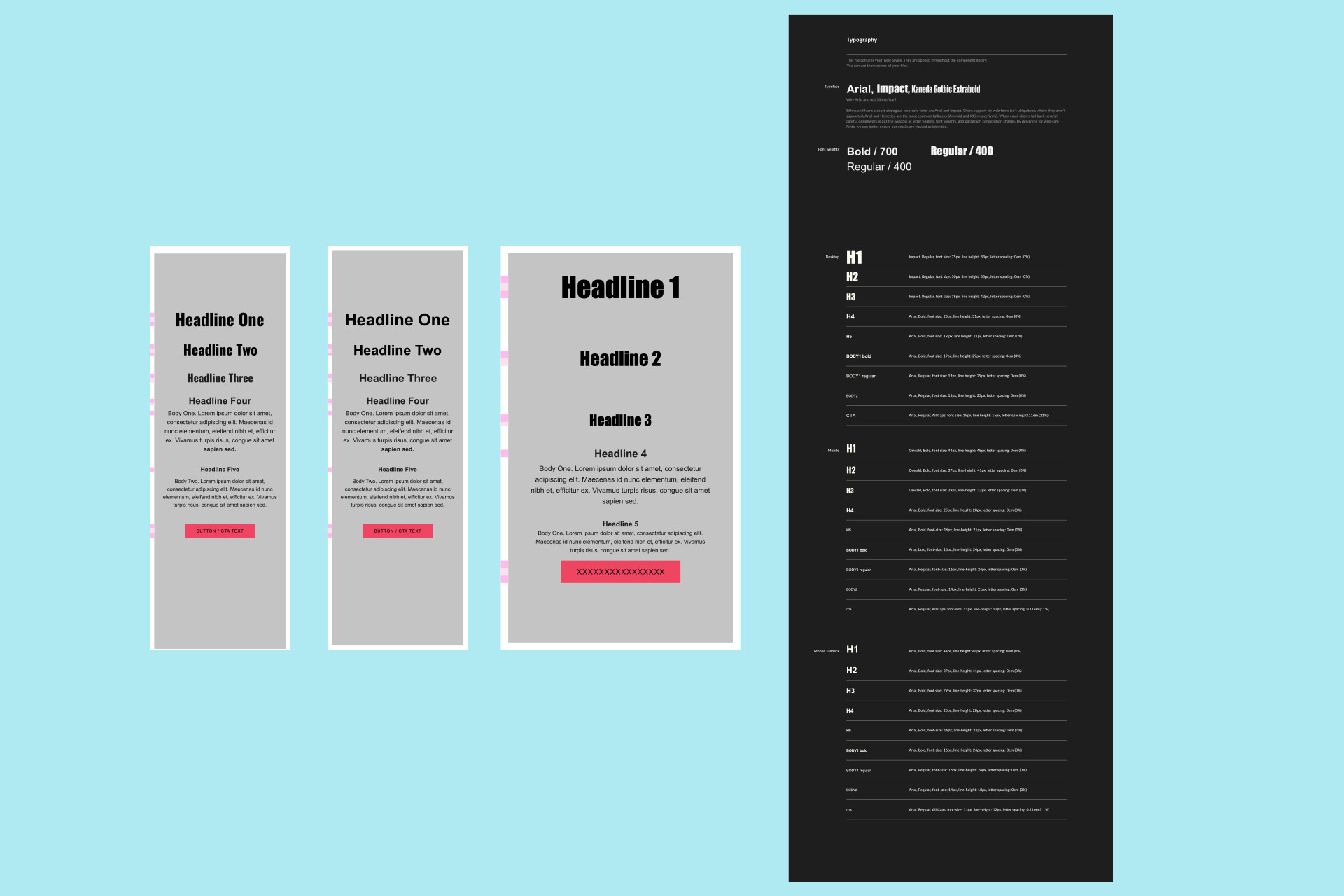
We began by mapping out our typography system and designing reusable components in Figma, making specific email design considerations at each step. Next, we leveraged snippets—reusable content blocks—to streamline the building and personalization of our emails. By incorporating elements like headers, footers, and complex logic blocks, we were able to update multiple templates simultaneously, enhancing efficiency and ensuring consistency throughout the email creation process.
Pantone® 419 C
C0 M0 Y0 K8
#1E1E1E
Pantone® 743 C
C0 M0 Y5 K0
#FFFEF2
Pantone® 178 C
C0 M71 Y59 K6
#EF4562
Pantone® 157 C
C0 M32 Y73 K7
#EDA23F
⸺ Qualitative Research
Gathered insights to help create a more user-friendly, efficient, and effective system for designing, developing, and deploying emails. This research focused on understanding the preferences, pain points, and behaviors of users who interact with the system—whether they are designers, developers, marketers, or end recipients.
⸺ UI/UX and Accessibility
Responsive design, clear hierarchy, and prominent CTAs with accessible features like color contrast and alt text were ensured. A balanced text-to-image ratio, personalized content, and tested across devices was maintained. Fast load times, and concise, scannable content for a seamless user experience was prioritized.
⸺ Testing and Optimization
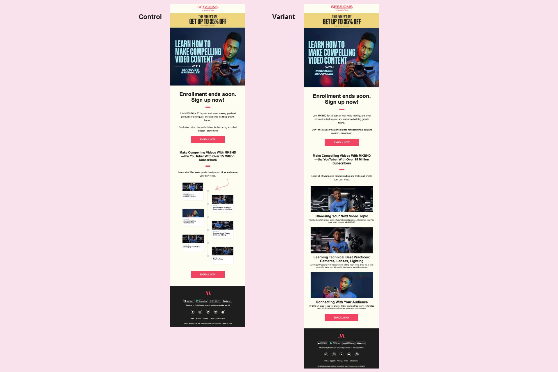
A/B Testing were constantly being conducted. we Regularly tested subject lines, CTAs, images, and other design elements to find what resonates most with your audience. Other testing included pre-send testing ensuring a consistent experience across all email clients and spam score testing. Continuous optimization leads to higher engagement.
⸺ Brand Consistency
We made sure that the email designs reflect the brand’s overall visual identity. We used consistent colors, fonts, and logos that aligned with all marketing materials. The tone of the email matched the brand’s high-end personality resonating with our recipients.
⸺ Dark Mode
Designing for dark mode required balancing aesthetics, functionality, and accessibility. We Focused on providing high contrast, legible text, properly optimized images, and easily visible CTAs. We also used CSS media queries to ensure our emails accommodated dark mode users and tested thoroughly across platforms.
⸺ Scalability and Ease-of-Use
Using a reusable component library and code snippets, we were enabling efficiently build unique yet consistent templates customized to specific business needs.